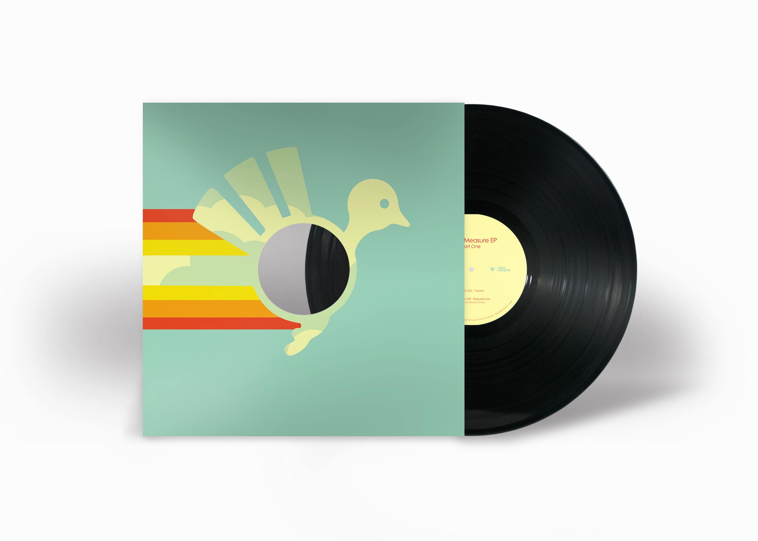
Club Night & Record Label: Aficionado/ Aficionado Recordings
Since 2012, I've been collaborating with Aficionado Recordings; a Manchester based record label specialising in vinyl only releases.
I'm responsible for all of their cover art, record middles and promotional material including clothing.
As sole Graphic Designer at Macclesfield College I was responsible for maintaining and developing their brand and visual identity. This included all printed and digital collateral.
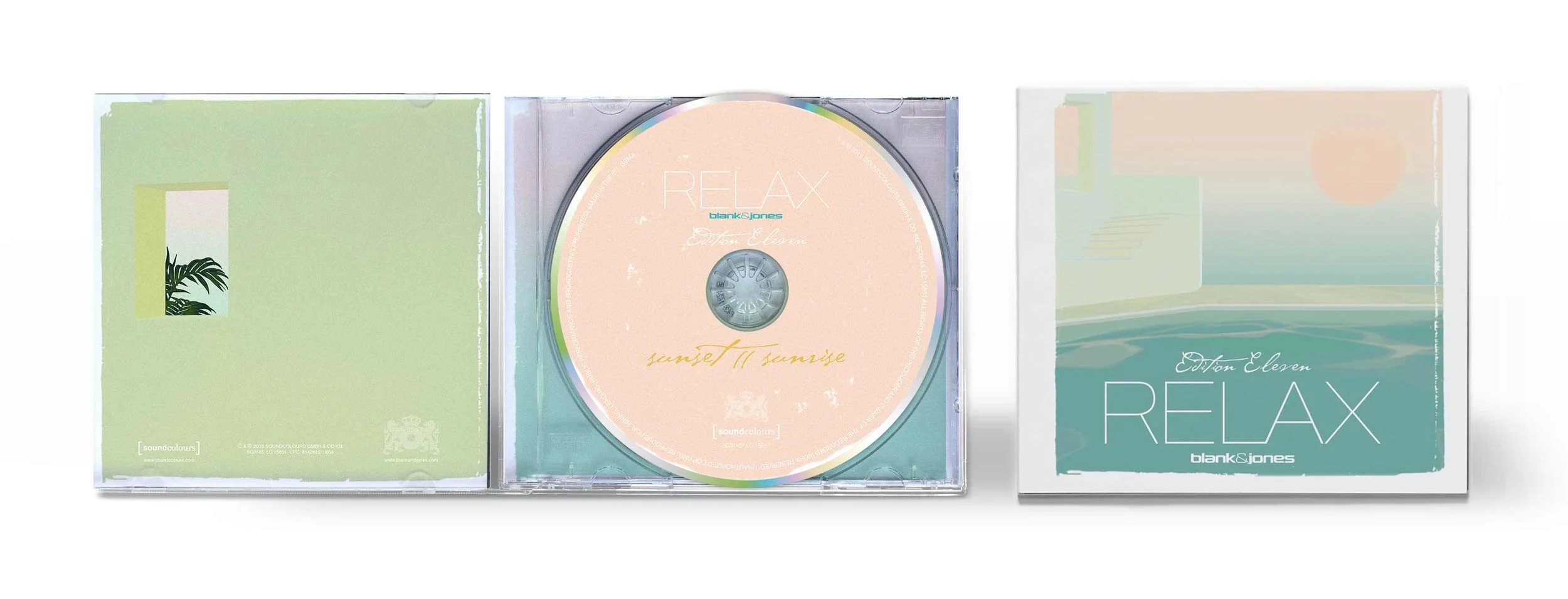
Relax Series: CD/vinyl artwork & layout for print and digital.
I have been collaborating with Blank & Jones on their Relax series since 2016.
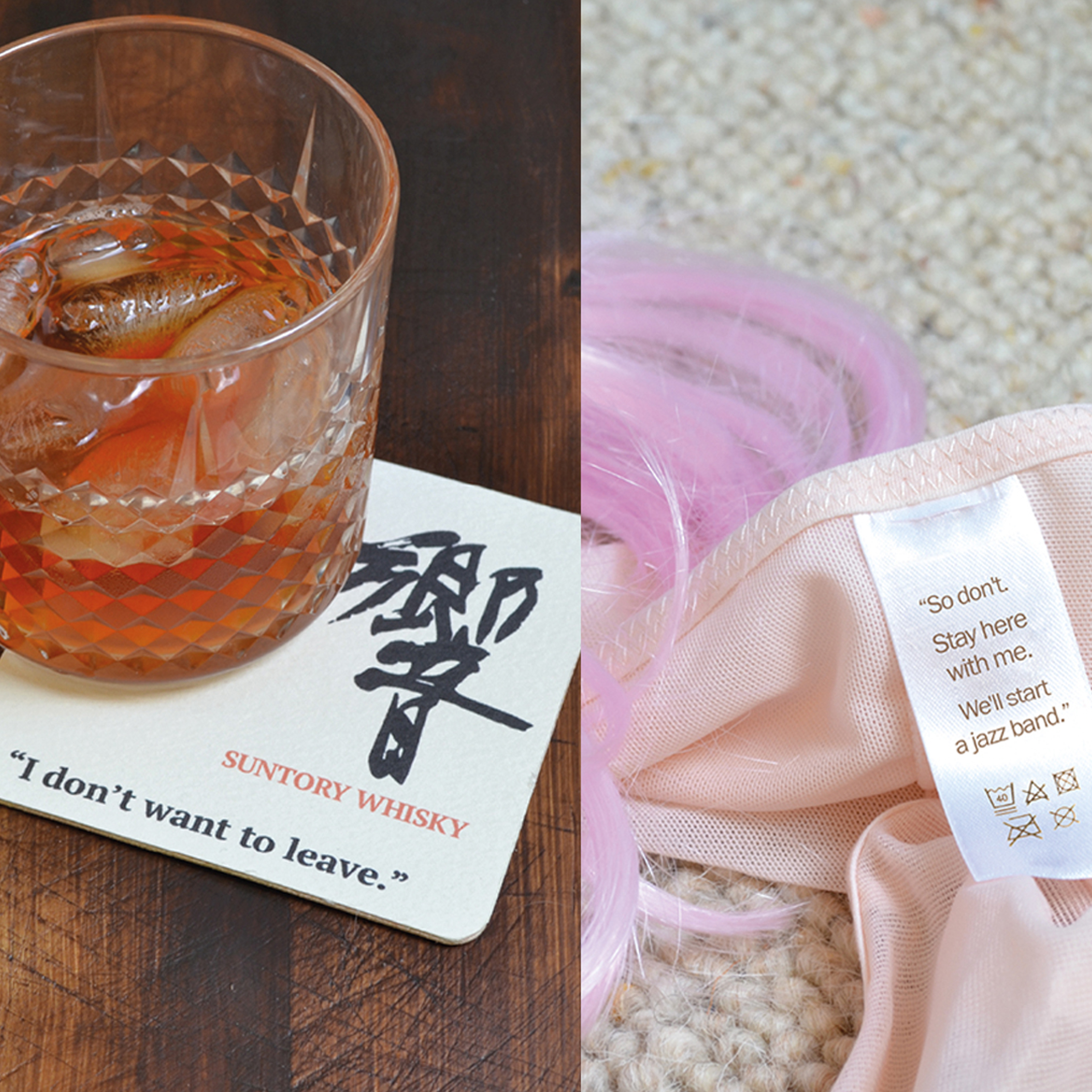
Lost In Translation
An advertisement for a screening of Lost In Translation at Somerset House. The series features a quote from the film that depicts a touching moment of realisation when the two leading characters discuss their journey coming to an end. I wanted to keep the characters quotes separate to convey the sense of loneliness and isolation that had drawn them together.
The adverts were achieved through a combination of stages; set, prop design and photoshop.
Moments In Time
Compilation album by Moonboots: Cover art and layout.
Hackney Community Report 2016: A quarterly report on the London Borough of Hackney.
The aim was to reflect the diversity within the community using varied graphic shapes which fit and mix well together. The monochromatic imagery is highlighted with a welcoming and friendly colour scheme.
Boutique Branding & Packaging: Yan Tyan Tethera Vodka
The distillery was set up by Daniel Harrison who'd run a chain of upmarket bars around London's Financial District after leaving university. At a time when Daniel was becoming disillusioned with London, he visited his parents back home in the Lakes and ran into an old flame Emily. They spent a glorious evening by Derwent Water drinking, watching moths by the moonlight and playing Yan, Tyan, Tethera; skimming stones onto the lake. He was ready to come home.
The brand is aimed at urban dwellers who would like to think that one day they will settle down in the countryside but really are happy with the convenience of city living. On a weekend they like to visit The London Tea Exchange at Spitalfields Market after their weekly Ocado shop has been delivered. If they have friends coming over for dinner, they’ll pop to Fortnum and Masons to pick up a nice bottle of wine or three. Or if it’s a really special occasion, a bottle of Yan Tyan Tethera.
The simple packaging aims to reflect the straight forward, down to earth values of Cumbrian life. Using Gotham an open, friendly, modern typeface. This juxtaposed against Neutraface Display echoes the tribal influences of Cumbrian history.
City Branding: Gothenburg